- I really wanted to keep the overall feel of the old site (the logo hasn’t changed much), but the original design didn’t always feel like it was very easy to move around. I’ve added a lot of little touches intended to make the site easier to use, like a way to browse backwards and forwards through all of the posts in sequence, quick links to skip straight down the page to the recipe and comment formatting that makes it easier on the eye to read a long thread
- My posts have metamporphosed shape of their own since I started writing them last year – you know that there’s normally a recipe hidden in the depths of each post, but it isn’t always easy to find one that you saw earlier. Recipes are now super easy to find through the new Recipe Index.
- I used to be a librarian in another life, so it was predicatable that the categorisation would be top of the list for a revamp. Posts about environmental issues are filed under Eat Green, nutrition matters under Nourish Yourself and those that try to make sense of the boundaries between the two are rather grandly filed under Econutrition. The recipes from the posts are also categorised with “what do you fancy now?” foodie headings under the afore mentioned recipe index (baking, beans and pulses, these sorts of things).
- The RSS feed now has little niceties like paragraph breaks and a proper link to click-through to read the rest of long posts.
- People who don’t use feed readers can opt to have new posts to Mostly Eating delivered straight to their email account.
- New visitors have a little note at the bottom of each page just for them, to give a feel for the kind of topics and recipes they will find around here.
Let me know what you think! Oh and do write and tell me if there is anything that is just plain confusing, or if I’ve left anything out from the old site that you’d like to see back.
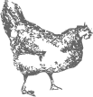
p.s I delegated the redesign task to my cats initially but this is all they could come up with, so in the end I had to do it all myself. A big thanks goes to my lovely husband Nik who helped with that really scary swopping over bit at the weekend!

 Come join me on Twitter
 Sophie Roberts is a registered dietitian based in Oxford, UK. She loves combining her nutrition know-how with a sustainable approach to buying and preparing food and shares her tips and recipes here at Mostly Eating.
{ 15 comments }
Very funky new design. Simple and intuitive navigation as well. Great stuff!
I Love the new design fresh and clean!
Really love the new design ! Specially the left top corner … looks so springy and wild !!! i wish i new something about designing a web page. I desperately need to make my own.
Love this new look! And I had a good chuckle when I saw what your cats came up with. :-)
A very pretty new look, Sophie. Adore it.
And the cats’ version is hillarious. Llol cats are the best!
Nice look, Sophie. Very clean and it almost breathes spring …
I just went to your home page to check out all of your links, etc. Nice job! I like how at the beginning of the post you can go to the previous or next one. And, your recipes on the note paper is reall cool.
Great job!!!!!
To be honest, I quite liked what Bert and Ernie came up with, but I suppose you know best.
I’ll get back to preparing your dinner for you, shall I..?
well the cats made a good effort, but your version of the new design looks great! love the recipes on torn note paper, very cool.
and happy belated blogbirthday!
Sophie, the new look is gorgeous! Nice work! And the cats seriously made me laugh out loud. :D A great big happy belated bloggy birthday to Mostly Eating!
A big, big thanks to everybody who has dropped buy to say they like the new design. Now all we need is some spring weather to complement it!
Bert and Ernie say Ta as well to those of you who voted for their effort :-)
Back to blogging about recipes and food next week, but I’m a bit stuck at the moment as our kitchen is full of wallpaper and trestle tables!
I love the format. I wish I could work out how to get next and previous post buttons on blogger.
Really lovely design. Elegant, whimsical, and so nicely organized. I love it!
It looks beautiful!
Looks great, nice re-design! :-)